Despite the widespread digitalization, despite the condemnation of advertising on banners due to the inability to calculate the effectiveness of such placement, outdoor advertising is still working. But it works only for 5% of advertisers. For the remaining 95%, it simply adds brightness to the city and info-noise to its inhabitants. Nothing more. If you are thinking of renting a billboard to place a banner on it, first read these simple rules that will allow you to get the most from banner advertising, and not just spend the budget. If you are not sure how to handle it, professional team from https://fortunasigns.com/ will be able to help you.
Rule 1: The principle of empty space
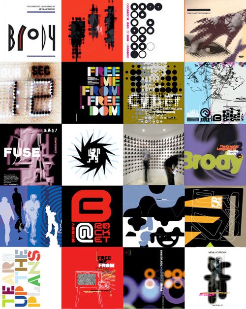
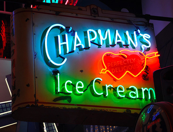
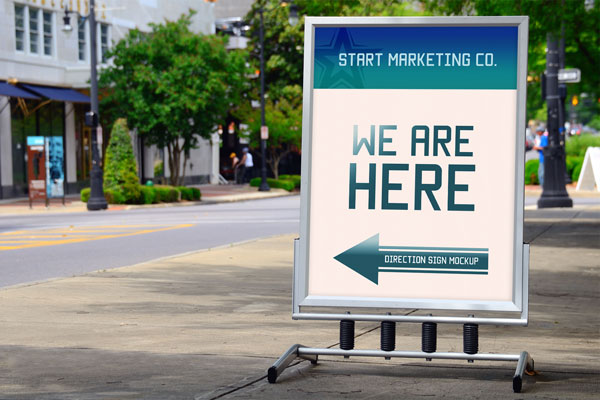
On the banner should be “air”, and the more it will be, the better. And do not think that if a billboard area is big, then you can roam there and tell about all your promotions and benefits. The percentage of occupied text and graphics area should be the same regardless of the size of the advertising surface. In fact, at least 60-70% of the banner should occupy just an unobtrusive, but rather a solid background.
Rule 2: One banner – one message
Do not complicate. A potential client, and so you create enormous difficulties: see your poster in the city, read, become interested, remember, make a decision. But he didn’t need you at all. Therefore, we always advertise only one offer: the most attractive, the most “tasty”. If you think that icons, labels, footnotes, subtitles are a harmless addition that only decorate the banner, then forget it. This is not true. Feel free to abandon all secondary information.
Rule 3: One banner – one visual
Do not make a collage of banner. And do not add pictures to it with a huge amount of small details. It just does not catch, and the money will be thrown to the wind. You need ONE image to complement your special offer, and the clearer, simpler and more concise it is, the better.
Rule 4: Brevity is the sister of talent
You came up with a headline that should get all the attention. Now reread it and cut it in two times at least. It should be as brief as possible. In order for us to have the opportunity to make it large and so that your client has time to read it.
Rule 5: One point of contact
Do not try to push on the banner all your work and personal phone numbers, website address, e-mail, Skype, WhatsApp. Understand, a person will only have time for a very acute need, and the essence of your proposal to catch, and the phone number to remember. And the number should then be something like 222-333. In other cases, it is simply meaningless. Outdoor advertising works on recognition. Your task is to be remembered by the consumer. If you remember the name – you can easily find it on the Internet. By name. So make sure that you are on the Internet.
Rule 6: Banner Order – Enterprise Order
Harmony is important in everything. The human eye intuitively separates the stylish from the ugly, even when your client does not have a developed sense of beauty. Do not forget about the equal fields from the edge, about the single lines along which the text is aligned.
Rule 7: Literacy beyond Beauty
Any even the most stylish banner will disfigure a grammatical mistake. When you work on the layout for a long time, the eye is “washed up”. So do not be lazy to give your banner for checking a few people. It is important.
Rule 8: Banner is not for the beauty of the city, but for reading by the client
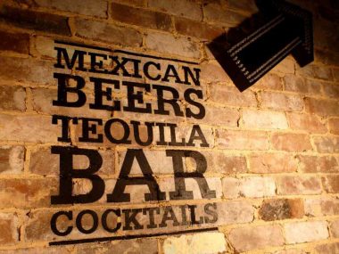
Don’t forget who your billboard is for. It is not for the designer to fill his portfolio with a creative project. And not for you to report on the development of a new advertising tool. It is for your client. And so that in seconds he caught the idea – do not create difficulties for him in perception. Instead of creative, choose a 100% readable font. If possible, write dark on light and discard the use of a bright hue of the font on another bright color of the substrate. Tip: Learn the color wheel and the compatibility of colors with each other.

