Think of design as a road map for consumers, taking them where you want them to go. Design makes an efficient way to get across the message and still make it pretty.
That last part is where things start getting sort of weird.
Sometimes I just don’t know what to think anymore when it comes to designers. I’ve seen and heard too much and it still keeps pouring in. Some designers are too weird for other designers. How does that ever happen?
While I pride myself on being a rule-breaker when it comes to design (because my ego won’t allow me to do anything standard and the insatiable need to hear people say they never saw anything like one of my designs) it is easy to get lost in the design and lose the message.
This seems to be a problem for many of us, as I hear countless designers complaining that the client has ruined their design with impossible limitations, and elements difficult to include.
That’s our business! We serve the client’s needs and sometimes have to accept their wishes.
Seeing design from the other side
We all know the endless stories of scams for free work, design-by-committee and micromanaging clients who fancy themselves as design geniuses— why do people seem to naturally assume that creatives are one-step from being zombies with computers?
Was it that we were the weird kids in school? Is it how “artists” are portrayed in the media? Is what we do just not considered a proper job? Whatever it is, it’s here to stay! So, how does one work around the belief we are just a shaved monkey?
The important thing about business… or war, is knowing your client/enemy. How do they think? What do they really want? How do they see design in conjunction with their business goals/world domination?
In many cases, odd design requests from a client are lost in translation. They think they are asking for one thing but in their attempt to explain something in “design terms” it strays in a completely different direction, as with my infamous tug-of-war with a company president who kept using the word “sophisticated” for her design parameters when she really meant “whimsical.” Two very different directions!
Despite the assumptions of how we live our lives, how we make a living and the differences between us and clients, it is our job to help guide the project to a successful conclusion. (Or follow the client’s wishes and then call them after the project flubs and laugh really hard as they answer the phone and then keep repeating “I told you so!” over and over until they hang up.)
Sometimes, however the non-creative person sees something we do not. The same ability to visualize things in our heads is what stops us from seeing the larger picture. Often it is mired in the power struggles between different departments in a large company or the interpersonal, one-on-one relationships we have with a smaller client.
The first step to becoming even more creative is to understand that there may be limitations for a good reason. The client’s belief in their own brand is the biggest one. Overexposure to really bad memes posted on Facebook may be another. The challenge in design must always be a clear message and sometimes, being more visual than wordsmiths, we just don’t see why our designs may be confusing to the client or just off their perceived brand. The fact is, that usually clients better represent their targeted demographics — unless they are 58 and working at MTV — they hold some hints as to what design direction will please, and win.
If you can understand the wishes of the client and take the limitations as a challenge and look for a unique but saleable solution, that makes you a great designer. Coming up with fabulously pretty pictures makes you a fabulous fine artist. If you want to be a fabulous designer, then remember; function wins out over form.
Living with limits
There are limitations for every design. I love when people ask me to “just go crazy” when designing a project. They just never say how crazy.
There are limitations on sizes, colors, fonts and technology. It’s important to know how far you can push not only your imagination without boundaries, but how far you can go with certain limitations and be great within the lines.
Did hearing that term about coloring within the lines perk you up a bit? Creatives don’t care about lines. We color outside of them, make new ones, hide existing ones and earn our place among great art on our parents’ refrigerator. Clients are the kids who cried if their Crayola left a mark on the middle of the line. Get the difference between us?
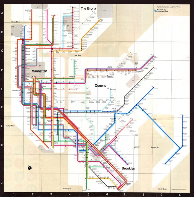
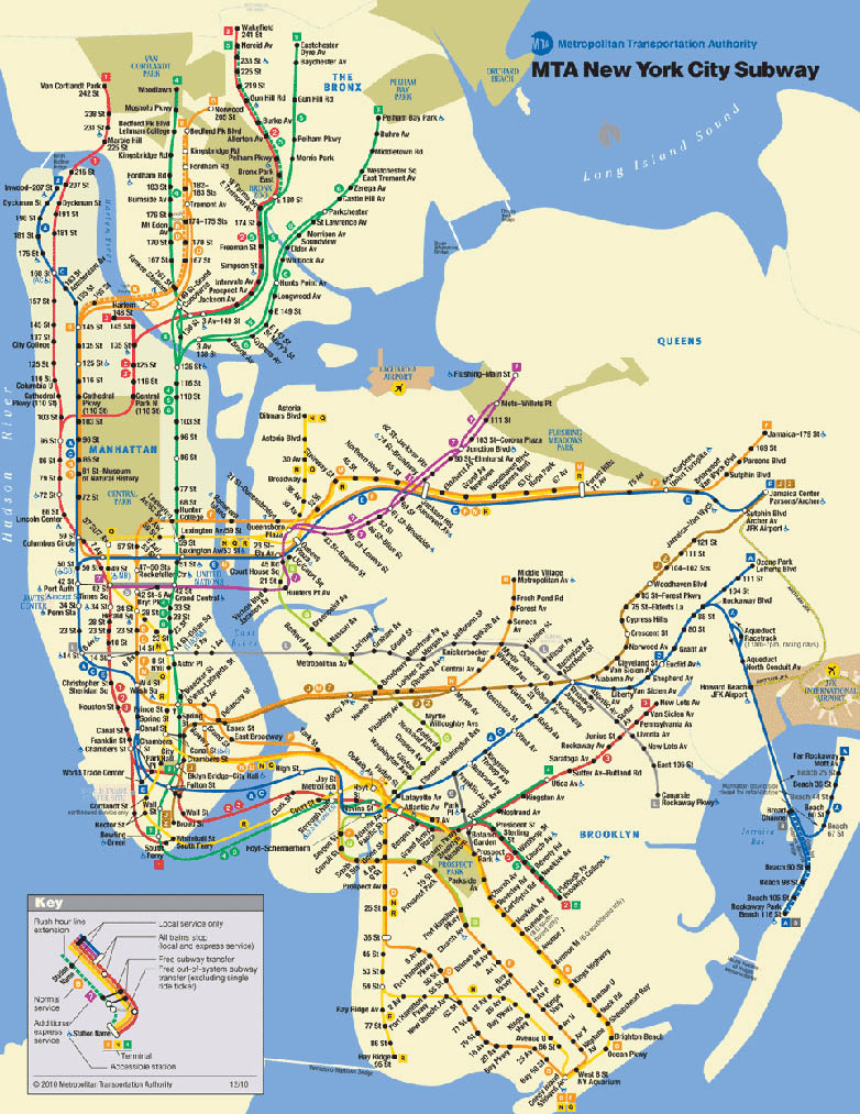
The New York City Subway Map, designed in 1972 (running until 1979 and then being “revisited” in 2011) by the recently departed Massimo Vignelli, is a classic example of the form having certain functions that had to be the foremost consideration and still Vignelli was able to design the most user beloved map in New York transit history.
Learn to push those limits
When you understand all of your options, there are no real limitations, aside from specific requests. “Make the logo bigger?” How big? It’s only a request and not a limitation. Maybe 10% is enough. Maybe 200% will look incredible? You have not been neutered as a designer — you are still challenged to create the best solution possible.
I was taught an advertising trick for coming up with the best product name or tagline; think up 20 names/taglines. The first five are easy. The next ten are a stretch. The final five are impossible but somehow you come up with them. You now have every possibility that works within the limitations of the product itself… and a few that are really out there, but that’s good! It means you’re thinking outside of “normality.”
There’s a layout trick that follows the same principles. Because we use computers in digital design, we are often more focused on the placement of individual design elements and then balancing the next element with the previous design element decision. There are some people who use cut-out elements and move them around a piece of graph paper but making layout sketches is still considered the key to exploring great layout possibilities. As with the advertising copy trick, draw out 15-20 pencil sketch layouts. The first five will be easy…
Another layout trick is to do a complete layout pencil sketch. Take it to the logical solution, until you are proud of what you’ve designed… then put it aside as a reject. Start over in a completely different direction. Repeat step one. Do this four or five times and then look at all of the layouts side-by-side. You will see a marked difference in all of them and can send 3-5 of them to the client, assured you met and exceeded all of your personal limitations, as well as those of the medium on which the project will appear. Most of all, no matter which design the client chooses, you’ll feel it’s one of your best.
You are responsible for great and poor design
Self-doubt is the greatest limitation in design. When I’m at a design event, and I receive a request to review a portfolio, my first questions is: “do you, as the designer like it?”
If the answer is no (it has to be either “yes” or “no” and not, “a little, kinda”) then why should I look at your portfolio? Why show me something you don’t like to represent your talent? The client didn’t “ruin” the project… you did by not handling the challenge to design within limitations and now you have a “a little, kinda” portfolio!
I know that sounds harsh, and judging by some of my former clients and the horror stories that abound in our profession, it seems impossible at times but as professional designers, we must take control, even when surrounded by those with “a pretty good design sense.” It can be one hell of an uphill battle but while giving the client what they want, you need to give them what they need or project failure will be blamed on you and there’s another one-time client, and a bad design with your name on it.
