As a web designer, it’s hard to stay organized. Not only are you balancing several projects at once, but you’re likely facing tight deadlines and tough clients as well. You may also be bouncing from brand to brand, and having to constantly learn new brand guidelines and styles.
Fortunately, there are many ways to make your workflow more efficient. To help out, I’ve put together these eight tips to keep you sane in your web design career
1. Keep your files organized
One of the easiest things you can do to keep your sanity is keep your files organized. Creating and maintaining a consistent folder structure will make finding your files a breeze. Problems arise when you structure one folder differently than another, making it a challenge to locate that Final-Final-logo.ai file.
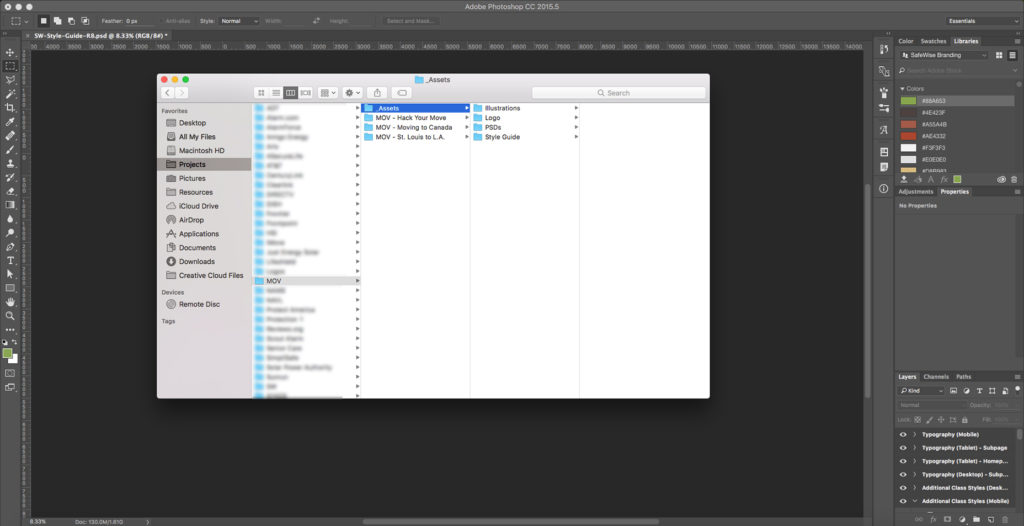
Consistent file naming conventions are essential when organizing your files. This is where versioning comes in. Some designers use dates, others use version numbers, and some use rounds. This will depend on your industry and your personal preferences, but it’s a good practice. Thanks to versioning, you can easily track which file is the most current, especially if you have old versions saved for reference.
I generally keep two to three old versions in case the client wants to revert back to that hero strategy from Round One, or preferred your mobile treatment from Round Two. In order to avoid the pack rat mentality, it’s good to archive or delete older files to keep your hard drive from being bogged down.
2. Understand your framework
One thing I didn’t learn until several years into my design career is how to properly utilize an existing framework. The two heavy hitters in the framework world are currently Bootstrap and Foundation, but Google’s Materialize will surely give them a run for their money in the near future. The company that I work for uses Foundation for the majority of their branded sites.
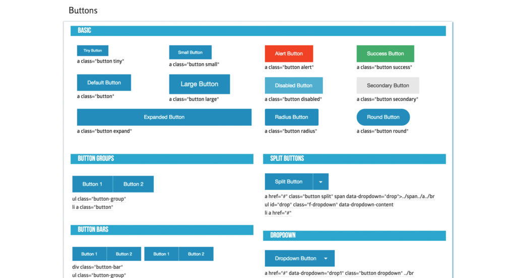
Foundation comes with a built-in responsive grid, along with styling for buttons, fields, typography, navigation, etc. amongst many other things to make your life easier. By utilizing Foundation’s built-in grid within your PSDs, you’ll make it easier for the developer to implement your designs in a more pixel-perfect way than if you do your own thing. Photoshop has this nifty guide layout tool that not only makes creating grids a breeze but also attaches them to the art-board for ease of file restructuring and movement.
3. Organize your layers by content section
When you’re dealing with complex web design PSDs with so many folders, layers, smart objects, etc., it’s easy for things to get messy. Once layer 2,455 comes around, you start to realize that you need some sort of organization within your PSD. This is why I recommend organizing your PSD by sections.
Mine generally consist of folders that include Nav, Hero, Intro, Packages, Benefits, Footer, etc. I also color code these folders in rainbow fashion, so they’re easy to navigate. This makes updating sections and reworking your PSD a breeze.
For example, if you need to make the hero section larger, you can easily drag all the folders below as one unit (holding command) and then drag them back after the update is made. This strategy also helps developers and other designers easily navigate your file. By using understandable names like “Hero” and “Nav”, a new designer can easily jump into the folder and make whatever changes they need.
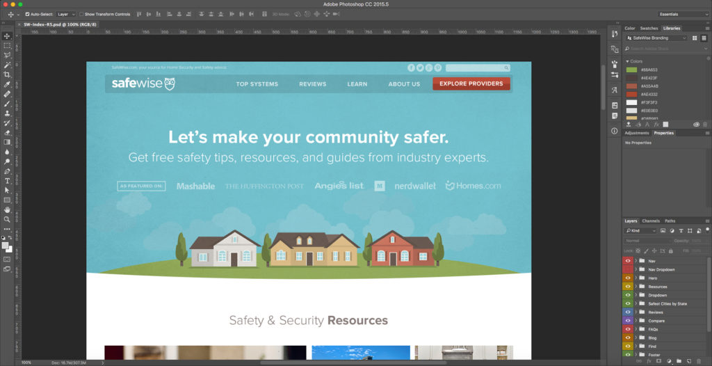
Some designers will even get into naming individual layers, which can also be incredibly beneficial but can get a bit time-consuming. Since layers are easy to find via the auto-select tool when it’s set to “layer,” it’s easy to get to individual layers these days, so it’s up to the individual designer how they want to organize their layers. The point is that you git ’er done.
